I have spent the last couple of months measuring nix, the operating system I am working on. Measuring is hard. Quoting Feynman:
"The first principle is that you must not fool yourself, and you are the easiest person to fool."
When you are measuring complex systems and the amd64 machine we are measuring is quite complex, it is important to separate the variables that can influence the results. Each possible variable needs to be modified separately in a different experiment. Each experiment has to be made many, many times. Then, we calculate some statistics and we are done.
Except...
Trying to modify each variable separately is not easy. In many cases, they are not independent. Also, some of them may not be under your control (network traffic, for example). Still, that is the subject for another post. In this one we are interested in calculating simple statistics and drawing them, which should always be the first approximation to a new problem.
Mean and standard deviation
We were taught how to interpret experiment results at school, by calculating the average and the standard deviation. It is very possible, being a programmer, that you think that this is trivial and to do it yourself in your benchmark. Well, it is not difficult, but it takes some care. It is easy to do it wrong (I know from experience).
First, the average needs to be calculated using an online algorithm. An online algorithm for the average (normally called a running average) just takes one sample at a time generates an average of what you have seen already.
Why is this important?, why can't I just add all the samples and divide by N?
Because, if you take a lot of samples (which you should) and add them, you will overflow the variable you use as accumulator.
There is also the question of numerical stability. The representation the computer uses for floating point is not equally precise across all the range. You have to be careful with the operations you do, so that they do not amplify the errors added by the representation. This consideration is specially important for calculating the standard deviation. If you calculate the standard deviation using the classical offline algorithm you will end up subtracting very big numbers to obtain a small one, one of the worst things to do. It is very easy when taking the square root to end up with an imaginary standard deviation, because of this problem.
The solution is to use an online algorithm to calculate both the average and the standard deviation. One which is carefully designed not to be unstable. Donald Knuth's Art of Computer Programming is the right resource for this kind of algorithms, and fair enough, we can find one in page 232, Vol 2, 3rd Edition.
A simple description of the algorithm can be found here:
The gist of it is:
Initialize M1 = x1 and S1 = 0.
For subsequent x's, use the recurrence formulas
$$M_k = M_{k-1}+(x_k-M_{k-1})/k$$
$$S_k = S_{k-1} +(x_k-M_{k-1})(x_k - M_k)$$
$$S_k = S_{k-1} +(x_k-M_{k-1})(x_k - M_k)$$
For 2 ≤ k ≤ n, the kth estimate of the variance is $s^2 = S_k/(k - 1)$.
This is an example of this algorithm written in awk I use for files with the results of time, which look like this:
1.34u 34.5s 25.78r
1.34u 33.5s 23.78r
...
So, we already know how to calculate the standard deviation and the average and that is all, we can draw an error bar diagram and we are done. Not quite. Without going deep into statistics, more can be done as first approximation to interpreting a group of samples.
Whiskers
The standard deviation tells you nothing about how the samples are really distributed. Yes, it can tell you if they are spread out but not how asymmetric or skewed the distribution is.
If the distribution is not gaussian or worse, not symmetrical, and many real distributions are not, the standard deviation is a bad estimation of how spread the the error is. It is better not to make any assumptions.
I prefer to use a box plot or whisker plot. A whiskers diagram draws a box spanning the first and third quartile (Q1 and Q3) with the median (the second quartile or Q2) in the middle and two whiskers depicting the error (what the whiskers represents varies among versions of the whisker diagram).
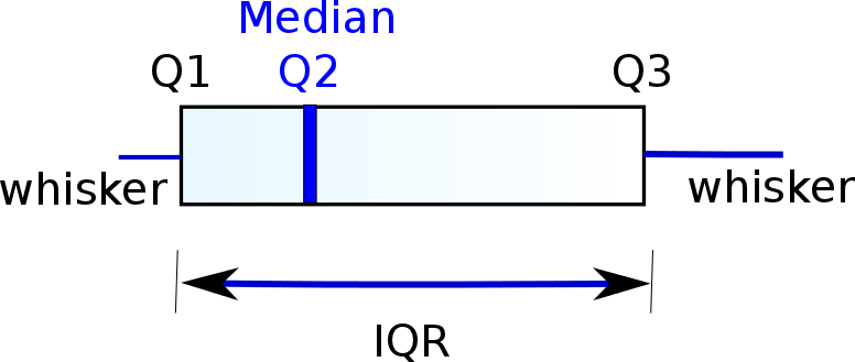
First of all, what is a quartile? The median is the sample that divides the samples in two equal sets (samples bigger than the median and samples smaller):

A quartile is the median of each of the sets which the median creates by dividing the original set in two. This can be applied recursively. If the number of samples of any of this sets is even, the median is defined as the average of the two central samples. For example for the set:
1 3 4 6 7 8
the median (or second quartile Q2) is $(4+6)/2 = 5$.
The first quartile Q1 is extracted from the lower set
1 3
and would be $(1+3)/2=2$ and Q3 would be 7.5.
There are other algorithms where the lowest and highest samples and the median are not used when calculating Q1 and Q3, this is method 1 in the wikipedia entry.
I normally use method 1, but there is not much difference in practice.
Going back to whiskers, what do they represent? Well, it depends on the version of the whiskers diagram. First, there is something called IQR (inter quartile range) which is Q3 - Q1. For many versions of the whiskers diagram, the whiskers represent Q1 - 1.5*IQR and Q3 + 1.5*IQR (I will call this version kind A). The other most popular version is that they represent the maximum and the minimum of the whole data (I will call this version kind B). I prefer the second one because, again, it does not make any assumptions about the data.
Anything outside of the whiskers (if there is anything) is called an outlier and sometimes they are drawn in the diagram and sometimes they are not.
In any case, a whisker diagram is very good because from a glance one can deduce
- How skewed the data is by looking at the relative position of the median
- How spreaded the data can be by looking at the whiskers
- If two groups of samples are clearly different by seeing where the boxes and the whiskers lay relatively to one other.
So, the next question is how to draw this diagrams given the samples.
As an example, see this little script which calculates the values of the box for numbers in the first column of a diagram of kind A. I use it with grap sometimes, when I need complete control.
What if I want to have a very pretty diagram with most of the work done automatically by the machine? In this case, I use R with ggplot2.
First, you need to install the R programming language. This can be done downloading some binary package for your operating system from the web page. This includes (among other things) two programs of interest to us:
- R, a text interpreter and
- Rscript, which is R but can be used as a interpreter for #! in scripts
Why Rscript is needed and R does not behave like any other interpreter, is beyond me, but it is how it is.
In any case, after that, next install ggplot2.
Fire R from the command line and run install.package like this:
> install.packages("ggplot2")
select the mirror and exit R and you are done.
You are ready to create the first plot. For this, first you need data. I am going to use as an example this file, which has a header and a body and looks something like this:
, Ncores, Time, Scheduler
X0, 10, 3.84, amp
X0, 10, 3.89, amp
The first line is the header, telling me what do the samples stand for. The first column identifies samples to be grouped together, for example all rows with X0 stand for a group of samples that should go in one box. We are ready to write a script to generate the graph.
We open a file and write this, which can also be downloaded here:
- #!/usr/bin/Rscript
- data <-read.csv("data")
- dframe = data[, c("Ncores", "Time","Scheduler")]
- colnames(dframe) = c("Ncores", "Time","Scheduler")
- library(ggplot2)
- ggplot(dframe, aes(x=factor(Ncores), y=Time, fill=Scheduler)) + geom_boxplot(outlier.size=0, size=0.2)
- ggsave(file="data.pdf")
Line 1 is the to make it a script, remember to use Rscript instead of R.
Line 3 selects which columns of data we are going to represent and line 6 gives them names.
Then we include ggplot2 (line 8) and we plot calling ggplot and geom_boxplot.
The second parameter is the aesthetics, which are parameters related to how the graph is displayed. Fill, for example, gives the color for the background of the box, which is chosen automatically to be a different one for each possible value. geom_boxplot parameter describes how outliers should be drawn (I am not depicting them) and ggsave writes the plot to a pdf file.
This scripts plots a whiskers plot of kind A, which is also called tukey diagram in honor to its creator (who also coined the term bit and the most used FFT algorithm).
If the meaning of the whiskers need to be changed, this can be more involved. An example can be seen in this script, where the result is not kind A or kind , kind B, but a custom made one.
We are finally ready to contemplate the result in all its glory (a pdf scalable version can be found here). Of course, this graph is quite baroque, but then again it expresses a lot of information.

No comments:
Post a Comment